Overview - Frontend web developer foundations
Languages and Technologies:
- HTML
- CSS
- Browser
In this module, you will explore the technologies that will allow you develop responsive, user-friendly, and asthetically pleasing websites.
Learning objective
By the end of this modules, you’ll be able develop simple but responsive, user-friendly, and asthetically pleasing websites.
Welcome to the Escuela.dev - Frontend web developer foundations module! Throughout this module, you will engage in a series of lessons that cover important topics necessary to develop modern websites.
After reading this first chapter overview you’ll start with the chapter on Developer tools.
2 - Chapter 2 - Developer Tools
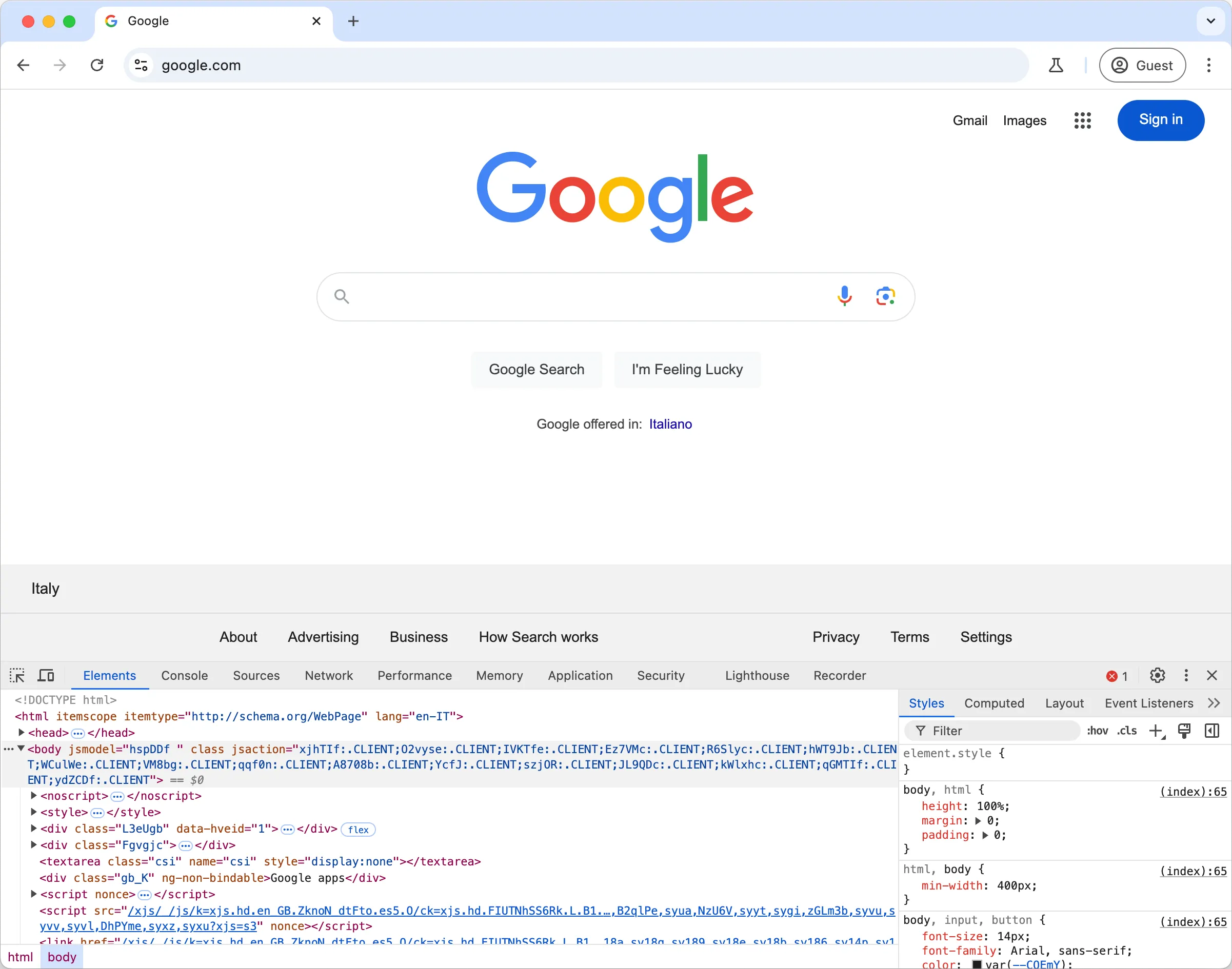
In this first lesson you’ll learn how to use the browser developer tools for inspecting and debugging layout and other issues on websites – later using JavaScript.
This is a fundamental skill to web development, allowing you to interact with HTML and CSS on a web page, troubleshoot issues and ensure your site looks as you indend to across various screen sizes.
3 - Chapter 3 - Introduction to Media Queries
In this lesson you’ll learn how to use CSS media queries to create responsive websites. This knowledge enables you to adapt your website’s appearance to different screen sizes, ensuring a seemless user experience regardless of the user’s device.
For example:
/* H1 tags' font size in screens smaller than 640px wide will be 32px */.header h1 {  font-size: 24px;}
/* and in screens larger than 640px wide the font size will be 24px */@media (min-width: 640px) {  .header h1 {    font-size: 32px;  }}
<one image with the two screens – side by side>
4 - Chapter 4 - Mobile-first development
This lesson introduces you to the concept of starting the design process from the smales screen, emphasizing progressive enhancement. This approach ensures websites are optimized for mobile devices and progressively adapt to larger screens.
5 - Chapter 5 - Deeper with Flexbox
In this lesson you’ll understand the CSS Flexbox web layout model, an essential layout method for crafting responsive web layouts. Using various CSS Flexbox properties, you’ll learn how to effectively manipulate elements within a flex container, mastering properties that control positioning, sizing, and ordering.
6 - Chapter 6 - Navigation
This lesson will show you how to build adaptable navigation UI (User Interface) elements. You’ll create navigation bars that adapt to various screen sizes display content in different layouts, using a combination of flexbox and media queries.
7 - Chapter 7 - HTML Forms
In this lesson you’ll learn the essentials of building HTML forms. You’ll explore various from elements and attributes to capture a wide range of user inputs and create interactive web forms.
8 - Chapter 8 - Fundamental Web Design Concepts
Finally, this lesson teaches you a number of UI and UX (User Experience) design principles and practicing wireframing. You’ll explore key web design principles such as consitency, simplicy, ease of use, and accessibility.
Further reading resources
Happy learning!